


Description
About the Training
Immerse yourself in the world of data visualization with our online Tableau training. Discover the concepts of business intelligence, analytics, and data analysis while understanding the nuances of traditional and modern BI approaches. Gain expertise in importing data into Tableau Desktop and create engaging visuals like bar charts, pie charts, scatter plots, and maps. Enhance your skills in visual customization, working with date features, and applying sorting and filtering methods.
Familiarize yourself with time-series forecasting and data presentation best practices, allowing you to develop appealing dashboards and stories that convey your insights effectively.
Main Training Areas
- Discovering the Essentials of BI
- Grasping the fundamentals of Tableau
- Exploring Data Visualization
- Exploring Advanced Analytics
- Building Compelling Dashboards
- Creating, and Formatting Data Stories
Training Audiences
- Business professionals who want to improve their data analysis and visualization skills using Tableau.
- Data analysts who want to learn how to use Tableau for advanced analytics and forecasting.
- Students who want to learn how to use Tableau for data analysis and visualization, and gain valuable skills for their future careers.
- Anyone who is interested in learning how to use Tableau to create insightful and interactive visualizations, regardless of their background or experience level.


Study Options
At TechClass, we understand that every learner is unique. That's why we offer two flexible and engaging learning paths to cater to your individual needs and preferences.

Self-Paced Learning: The Power to Learn at Your Own Pace
Our Self-Paced Learning option puts you in complete control of your educational experience. Gain access to a wealth of carefully curated digital resources, including interactive videos, quizzes, and assignments that you can study at your convenience. This approach empowers you to balance your personal, professional, and educational life seamlessly, progressing at a pace that aligns with your goals and commitments. Take charge of your learning and achieve mastery on your terms.
Learn moreBlended Learning: The Best of Both Worlds
Experience the perfect blend of online and in-person learning with our Blended Learning workshops. This approach combines the flexibility of self-paced study with the dynamic engagement of instructor-led workshops. Dive into our comprehensive digital resources and then enhance your understanding by attending interactive workshops led by industry experts. Benefit from real-time feedback, group discussions, and hands-on activities to solidify your knowledge and develop essential skills. Our Blended Learning path fosters collaboration, cultivates critical thinking, and offers a rich learning experience tailored to your success.
Learn more
Training Support


Graduation
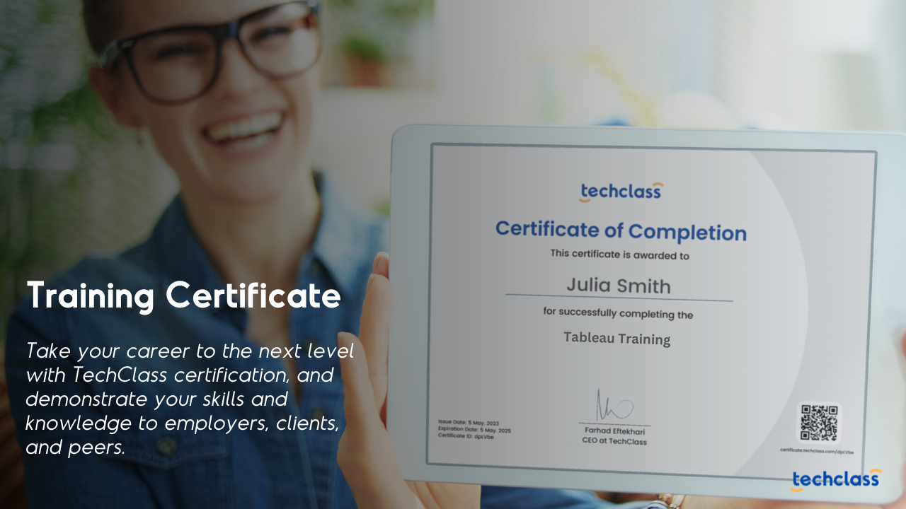
Training Certificate
Upon completing this training path, you will receive a certification from TechClass that recognizes your expertise and knowledge in your field. With this certification, you can demonstrate your skills and knowledge to employers, clients, and peers, and take your career to the next level.
Our Clients